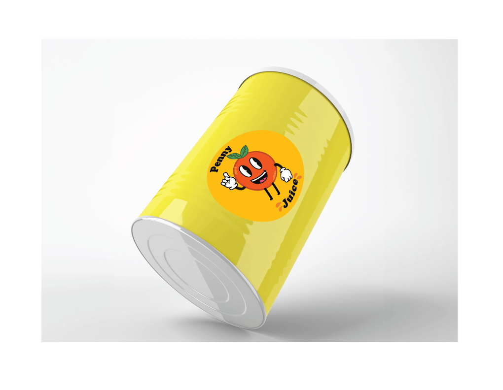
Design Problem:
Getting kids to want to consume a healthy juice can be hard especially if the packaging is bland. It neither makes the child interested nor does it make it a memorable brand that stands out to them. Personally, when grocery shopping and going into the kid’s juice section I have not seen any brands use fruit as their mascot to promote a kid’s juice brand.Design Solution:
Thus the “penny juice redesign” with its orange mascot is sure to leave a memorable expression on kids and parents. Its cartoon like animation makes it catch children’s attention and makes them curious about the juice. Making the chances of them drinking it much higher. This product can be ordered online with juice bottles ready to drink or even fruit concentrates for larger events.Audience:
Childcare Providers, Daycare Centers, PreschoolsSoftware:
Adobe Illustrator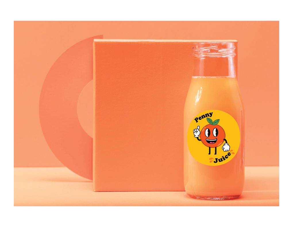

Design Process:
When initial idea for my “penny juice” logo was to have a variety of fruit stacked around each other and then the brand name next to it. However, I quickly ditched this idea since upon finishing the first sketches I thought it was quite bland and not very kid like. It was until I stumbled across these old-school fruit cartoon characters. I thought to myself I could work with these. I tried out a variety of the fruits but ultimately chose an orange since it would work best with scalability. Upon receiving critique from “creative services” I realized that outlines would be my best friends since the mascot itself gave very early 2000’s cartoons. Which if we look at those most have a thick outline. This too would help me decide on my final typography that would tie the brand all together.